Monday, 26 March 2012
Coursework Ending
This is a blog which is stating that our blog is closed now and that no further blogs will be made. We have enjoyed this period of creating our music video and have learnt and developed alot through this period. Our skills and abilities have improved significantly in terms of our editing skills and also the actually filming of our music video in London.
Monday, 12 March 2012
Tuesday, 6 March 2012
1. In what ways does your media product use, develop or challenge forms and conventions of real media products?
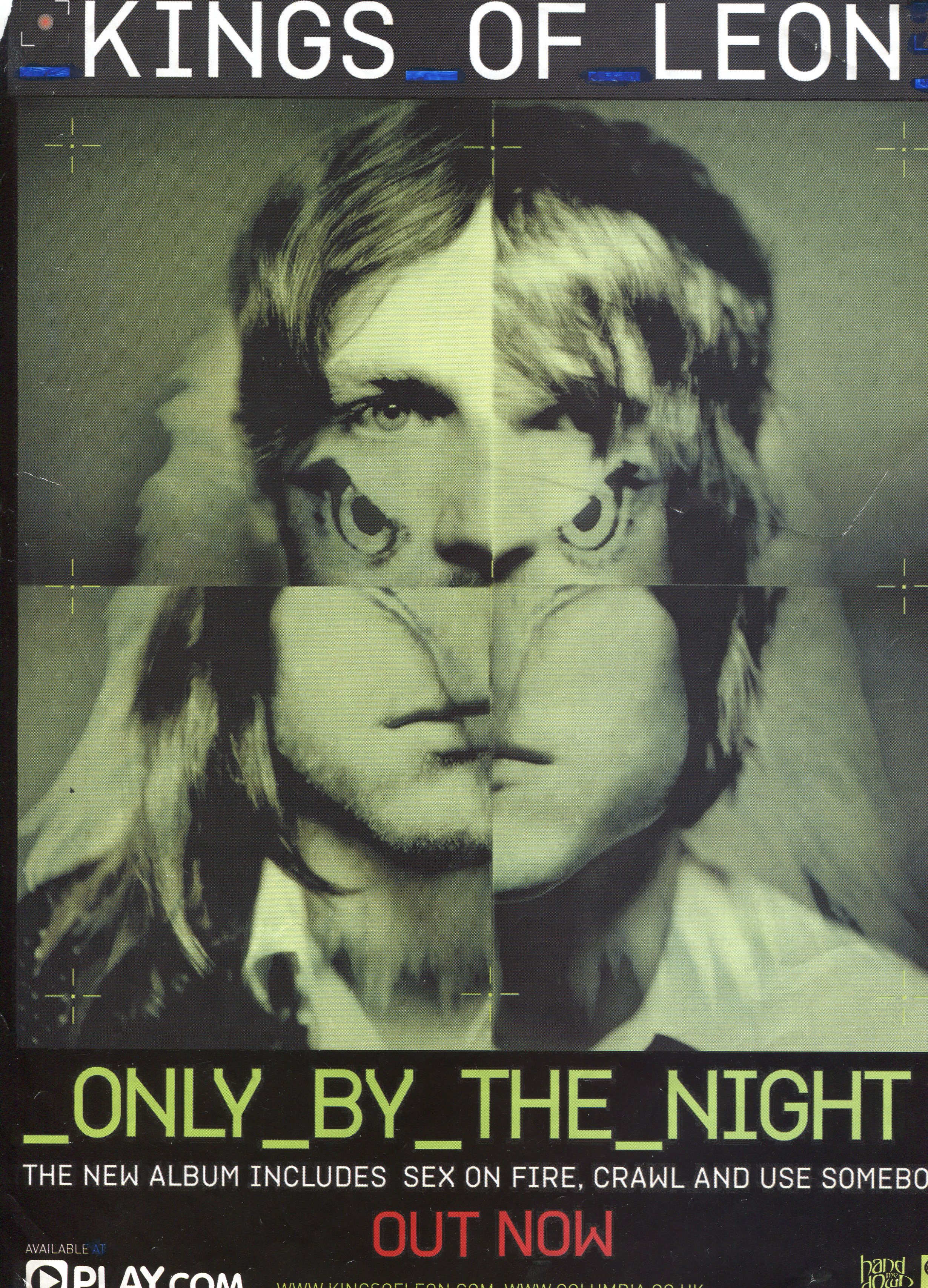
The first thing we did at the beggining of this coursework was too research music videos themselves and also adverts/posters and digi-packs. We also analysed them and the characterstics of which they have and different concepts and ideas that make these products stand out from the rest. The research for our digi pak was not that easy as we can only base our research on what we saw. However, this was sufficient as we still wanted to maintain that urban feel to the whole concept of the digi pak and advert poster of which we used an old wall, which again adds the urban mise en scene to the whole concept of it aswell as the hoody of which the artist was wearing on the front cover.
The first major part of our media product was the research of the genre (dubstep) and the different kinds of music videos that are usually associated with certain genres of music, for example, pop songs usually have a dance routine and sometimes a slight narrative theme to it such as "Baby One More Time" by Britney Spears.
We also did a textual analysis of a song, mine was "Shot Yourself In The Foot Again" by Example and also "To The Stars" (Break the Noize and The Autobots Remix). I noted the ways in "Shot Yourself In The Foot Again" depicts a very well done narrative storyline and the way the beats and lyrics of the song match the way the song is edited and told. Another aspect of the textual analysis is how the audience percieve the artist both in terms of the music video but also in the public eye. Aswell as just analysing the music video it also gave us an oppurtunity to develop and create ideas.
We also researched the history of the music video where we made a timeline of the crucial and main events/parts of the life of the music video and also made notes on the "100 Greatest Music Videos Ever", which was a documentary of which we watched in class and took notes on the music videos and how they incoporated a huge variety of ideas and effects to make it in the top 100 music videos ever.
As many real dubstep videos, the artist usually doesn't make any appearance in their videos but sometimes they make a cameo appearance, where they only appear in the background of the video for one scene and for a very short amount of time. We did do this in one of the flash back scenes, the one where the main character is with his friends.
One convention that we did go against is the fact that most dubstep songs show live concerts and performance from festivals and gigs. Not all dubstep music videos are like this but the majority of them are, however we took more of a narrative approach to our song because our song is not a "live" song which means that it wouldn't necessarily be a song that would be played live at a concert and therefore ,would be difficult to film. As you can see we have incorporated many of the ideas that we have posted in our blog. Since dubstep is a growing genre, coming from the underground world of music in London, we decided to use "urban" stytle text and this has been consistent throughout our blog. However, we have gone through different styles of text and font and we have also used many different sites and programs to find a good font and one of the main websites we used was called "Da Font" which offers a huge variety of fonts.
Da Font Logo:

This is the link to the website, "Da Font": http://www.dafont.com/
The first major part of our media product was the research of the genre (dubstep) and the different kinds of music videos that are usually associated with certain genres of music, for example, pop songs usually have a dance routine and sometimes a slight narrative theme to it such as "Baby One More Time" by Britney Spears.
We also did a textual analysis of a song, mine was "Shot Yourself In The Foot Again" by Example and also "To The Stars" (Break the Noize and The Autobots Remix). I noted the ways in "Shot Yourself In The Foot Again" depicts a very well done narrative storyline and the way the beats and lyrics of the song match the way the song is edited and told. Another aspect of the textual analysis is how the audience percieve the artist both in terms of the music video but also in the public eye. Aswell as just analysing the music video it also gave us an oppurtunity to develop and create ideas.
We also researched the history of the music video where we made a timeline of the crucial and main events/parts of the life of the music video and also made notes on the "100 Greatest Music Videos Ever", which was a documentary of which we watched in class and took notes on the music videos and how they incoporated a huge variety of ideas and effects to make it in the top 100 music videos ever.
As many real dubstep videos, the artist usually doesn't make any appearance in their videos but sometimes they make a cameo appearance, where they only appear in the background of the video for one scene and for a very short amount of time. We did do this in one of the flash back scenes, the one where the main character is with his friends.
One convention that we did go against is the fact that most dubstep songs show live concerts and performance from festivals and gigs. Not all dubstep music videos are like this but the majority of them are, however we took more of a narrative approach to our song because our song is not a "live" song which means that it wouldn't necessarily be a song that would be played live at a concert and therefore ,would be difficult to film. As you can see we have incorporated many of the ideas that we have posted in our blog. Since dubstep is a growing genre, coming from the underground world of music in London, we decided to use "urban" stytle text and this has been consistent throughout our blog. However, we have gone through different styles of text and font and we have also used many different sites and programs to find a good font and one of the main websites we used was called "Da Font" which offers a huge variety of fonts.
Da Font Logo:
This is the link to the website, "Da Font": http://www.dafont.com/
Monday, 5 March 2012
Sunday, 4 March 2012
Saturday, 3 March 2012
4. How did you use media technologies in the construction and research, planning and evaluation stages?
The Blogger service is what we used to construct our online blog about our music video. The service is easy to use and we were able to input all our research which we built up to the blog. We were also very familiar with the concept of the blog and how it worked because we used it last year during our coursework at AS- Level. The blog automatically saves all our information at certain times while we are on the blog and we could relate back to it during the preperation of our video. Blogger made it much easier for us to save our work as it did not fill up our hardrive and automatically saves our posts. We would definitely use this software for future projects as it is easy and reliable to use.

The software we used to make our video was 'Final Cut Pro x' which is exclusively a Mac editing software. We were able to input professional effects and transitions using this software. It allowed us to make well timed cuts so our music video flowed well with the beat of the song. This software also helped when coming to the lighting of certain scenes, for example one of our clips were too dark and this software let us change the brightness and contrast of this clip in order to make it more visable. As some of our scenes were flashbacks they needed to be noticably different from the rest of the video, this software allowed us to use black and white effects and blur effects to emphasise the flashbacks and therefore give the full effect of them. This software was user friendly and easy to use, however we felt as if there was a lack of good quality effects and transitions within the programme.

To research alot of other music videos we used online software such as YouTube and Vimeo. Via the website "Vimeo", we were able to look at other media A2 students videos from not only within our class but other A2 students and learn from their ideas. As well as student videos, we found looking at professional videos of real and professional artists which gave us ideas of different effects to use, which would look good in our film. Looking at other videos of the same genre as ours which is mainly electronic music (more specifically dubstep) we found that most of these songs change scene with the beat of the song so we used this when coming to the editing of our video. YouTube gave us a chance to look at past students work and also upload our own video on the site in order to get feedback from the public.
The camera we used was our teachers Nikon 550 HD camera. We used this for taking the shots for our CD covers and poster/advert. We have never used this piece of equipment before hand but we found this camera extremely easy to use and function and it produced high quality pictures, which however were ruined a but when it was uploaded onto photoshop and they became slightly distorted and blurred.

To film our project we used Panasonic Standard definition cameras. Although these were not high quality as we would have liked we made do and were able to get some good quality shots for our video. We were familiar with this camera due to the fact as mentioned before that we have used this piece of equipment last year in our AS-level coursework.

The other piece of software which we used was Adobe Photoshop CS5 . Photoshop allowed us to alter the contrast of our images and insert text and images to make them look more professional and to the best of which we can make them including the digi pak and poster. Our skills in photoshop have definitely benifitted and improved from using photoshop as me or my partner have really used it before and therefore found it difficult to use at the beginning of the task but after a bit of practice we were happy with using the software and got to grips with it fairly rapidly.

Each of these programmes, hardware and pieces of equipment has given us more skills in the editing process aswell as general comuting abilites. We are happy with all of the equipment which we used and have found these as a great help to the creation and development to our media coursework.
Each of these programmes, hardware and pieces of equipment has given us more skills in the editing process aswell as general comuting abilites. We are happy with all of the equipment which we used and have found these as a great help to the creation and development to our media coursework.
Wednesday, 29 February 2012
2nd Draft of our video
All we need to add now is the final flashback scene near the end of the video and we both agree that come of the cuts need to match the beat more accurately.
Tuesday, 28 February 2012
Final DigiPak design

Monday, 27 February 2012
Inside Cover Final Design

Final Back Cover Design

This is the final draft of the back cover. We decided that just a picture of the wall was better than the image of him on the bench which we changed to the inside cover. The text is easier to read and it matches the front cover more.
Final Choice for Front Cover of Digi Pak
We both decided for the front cover and back cover we preferred the version of the pictures with 40% higher contrast. We decided to put the album name in and made some final changes to the artist name.


Final Poster Design

Thursday, 23 February 2012
Class Feedback from the First Draft
Our whole class watched the first draft of our music video. They had a few points on how we could improve it when it comes to our finishing it off. Some of these were:
- Timing at the beginning when the actor moves his head up to match the song
- Make some shots lighter as they are un clear
- First shot may be too long
- More cuts and edits
- More sense of story
- Use flashbacks to tell storyline
- Longer shots of london, some cuts are too quick
Sunday, 19 February 2012
1st Draft of our video
We need to add all our flashback clips to tell the story of the video better at the moment it doesnt make much sence why the character seems depressed.
Wednesday, 15 February 2012
During Filming
We decided to film right next to The Embankment in the centre of London. We chose this location because of the well known attractions of London such as the London Eye, Big Ben, St.Pauls Cathedral and the skyline of London in general. Also, the lighting on the embankment was perfect for the mese en scene of our video, which is the dark and sinister look with ofcourse enough lighting for a clear shot.
However, we did encounter a problem, which was that we arrived in London far too early and it was not dark enough for us to film so we had to wait around 3 hours for it to become dark enough outside in order for us to film. Also, we had had a period of time of which we can film because we didn't want to take too long because it would of been too dark and therefore not give a clear image.
We were able to film during the time period but when we were looking there is one shot where the character is sitting down on the stairs of a monument which is one of the last shots we filmed and it is darker than we anticipated. So when we start editing we are planning to increase the contrast of the shot in order to bring it to the best we can but still not make it too light so it doesnt blend in with the rest of the video.
In conclusion I believe that our filming went very well with very few mistakes and problems of which we encountered.
Wednesday, 1 February 2012
Draft of Poster

Tuesday, 31 January 2012
Draft of Digi Pak

Friday, 27 January 2012
Album Poster Draft

Editing Software
For our project we are using a software called "Final Cut Pro X". This is a new kind of software and is differnt to the one that we haved used before hand called " Corel VideoStudio 12". This is a video that I have found that demonstrates a few techniques and effects on a piece of raw footage, that I can use in our music video. Certain effects are not at all what we need but a few of the "Blur" section of the effects can be of use to us and some of the "Blur Transistions".
Tuesday, 24 January 2012
Design Of Digi Pak
Digipak is a patented style of CD, DVD or BD packaging, and is a registered trademark of AGI World Ltd.I found designs of Digi Paks on the Internet that we wished to style ours around, it simply includes the front and back cover which we will design using photoshop. It wont be hard to put together and will include information such as the track names and the sponsors of the artist.
Second Draft of Back Cover for Digi Pack

For this cover I have cut down the sides of the picture in order to make it more of a reasonable and suitable size for a digi pack. I have also contrasted the back of the cover to the same of the front which is a contrast of 40% in order for them to match. I have also changed the text style and colour in order for the audience to make it easier to read. We may decide to use this for the inside cover instead.
Monday, 23 January 2012
Back Cover First Draft

This is the first draft of the back cover to our digi-pac. I need to add more visual effects and also the different contrasts we can incorporate. I will also need to add certain additions and packs to the cover such as, "including a 4 minute video to the numbre 1 song in the dubstep genre 2011".
Images for Digi Pak


First Drafts for Front Cover of Digi Pak


Sunday, 22 January 2012
Digipak Research
Digipaks typically consist of a gatefold paperboard or card stock outer binding, with one or more plastic trays capable of holding a CD or DVD attached to the inside. IMPAC Group, Inc. originally owned the Digipak trademark. That company was acquired by MeadWestvaco in 2000 and folded into its AGI Media division. Following this acquisition, the Digipak name and designs were licensed to manufacturers around the world and MeadWestvaco sold AGI Media to Atlas Holdings in 2010.

In this digipak, it gives an urban/ hip-hop kind of vibe to it because of the kind of font that is used and the type of tribal patterns used aswell. Also, notice how one of the back covers (back cover I think) is the same as on the CD itself. The white mask can cause an effect of mystery and that possbily some of the songs that are in the album could contain some personal or dark lyrics that may be offensive or maybe a way to tell the public about his personal problems.


These are the outside and inside of the digipak belonging to the band called "Enter Shikari". Enter Shikari is a band that is from St.Albans in Hertfordshire and the play a genre of music that is a combination of techno, rap and rock music. The inside of the digipak is a very colourful, tranquel and vibrant image of two trees and a field whilst the sun is setting. This image can illustrate the title of the album which is called "A Flash Flood Of Colour", this can relate to the imagery and diversity of the inside album cover. The triangle that is seen on the inside cover is also found on over covers of the digipak however, the triangle changes colour which again can relate to the album name and the other changes in colour througout the album.
The outside of the digipak consists of what "Enter Shikari Are:" this includes what instruments they play and who plays them, so this gives info on the band itself. It also includes "Gang Vocals" who are other people/artists outside of Enter Shikari. Again the triangle appears but in a different colour (blue) as it could contrast with the purple background. This cover of the digipak also includes legal rights and copyright protection logos and also says the types of management which has participated in making this album.
Album Adverts in Magazines:


Saturday, 21 January 2012
Parental Advisory

Due to the evolution of the music industry and music culture, more artists are encorporating swear words and explicts into their songs. This ofcourse some audience members may find offensive and therefore this logo pre-warns the audience but particulary the parents that this album/single contains some strong and offensive language. However, the quesion arises of "What can the parents actually do once the child hears these explicts?" A parent would not be able to stop the child from hearing these words but the only thing that they can do is not buy the album, which ofcourse affects the artists and their record companies.
Friday, 20 January 2012
Idea for video
A scene from the movie "Kidulthood" has given us inspiration and ideas on what we can incorporate into our video and also ideas and shots on how we can really show the emotion of the character. From the beginning of the clip to 1:26 is the time period of which depicts the effects and ideas from and how can can manipulate them into our own ideas. However, at the time of 8:46 the theme of the first time period as mentioned before carries on and this again can be shown in our video or there is the possibility that it could be left on a cliff hanger. However the video we put up for this clip has now been removed off YouTube and therefore we are unable to show it.
Another idea and shot that we are trying to incorporate into our music video, which are the shots of London City. It should include famous sites such as the London Eye and also St.Pauls Cathedral. This can be shown in various shots in the song "Keep It On a Low" by Dot Rotten who is a UK grime artist. We think that the shots of the London skyline and famous sites that it has such as the London Eye and Big Ben.
Another idea and shot that we are trying to incorporate into our music video, which are the shots of London City. It should include famous sites such as the London Eye and also St.Pauls Cathedral. This can be shown in various shots in the song "Keep It On a Low" by Dot Rotten who is a UK grime artist. We think that the shots of the London skyline and famous sites that it has such as the London Eye and Big Ben.
Thursday, 19 January 2012
Risk Assesment
HAZARD | A Severity | B Likelihood | Risk rating | |
1 | Tripping in Street | 2 | 8 | 16 |
2 | Road Danger | 7 | 6 | 42 |
3 | Train Danger | 6 | 5 | 30 |
4 | Attracting unwanted attention | 7 | 6 | 42 |
5 | Medical Issues | 5 | 2 | 10 |
6 | Problems at location | 4 | 2 | 8 |
7 | Terrorist Issues | 10 | 1 | 10 |
HAZARD | CONTROL MEASURE PRECAUTIONS |
1. | Wear appropriate footwear, be aware of surroundings |
2. | Be aware of cars on the road |
3. | Check trains are running and stand clear of the tracks |
4. | Don’t flash hardware and try to stay away from dangerous areas |
5. | Neither of us have health issues however if either of us are ill we will take medication |
6. | Check no protests are on before going to the location |
7. | Keep an eye out for suspicious people and stay clear of them |
Shooting Schedule
Shot no. | Date/Time | Location | Cast | Crew | Costume/Props | Equipment |
1 | 4/2/2012 Start filming at 4:00 pm – 4:20 pm | London - The Embankment | Ashley Rex | Will Trotter Louis Watkins Ashley Rex | Barbour Jacket Jeans Hoodie NY Flat Cap | Camera Tripod Light Light Filter |
2 | 4/2/2012 The first shot should take a few mins. 4:50 pm – 5:20 pm | London - The Embankment | Ashley Rex | Will Trotter Louis Watkins Ashley Rex | Barbour Jacket Jeans Hoodie NY Flat Cap | Camera Tripod Light Light Filter |
3 | 4/2/2012 5:20 pm – 5:45 | London - The Embankment | Ashley Rex | Will Trotter Louis Watkins Ashley Rex | Barbour Jacket Jeans Hoodie NY Flat Cap | Camera Tripod Light Light Filter |
4 | 4/2/2012 5:45 pm – 6:15 pm | London - The Embankment | Ashley Rex | Will Trotter Louis Watkins Ashley Rex | Barbour Jacket Jeans Hoodie NY Flat Cap | Camera Tripod Light Light Filter |
Subscribe to:
Posts (Atom)