Wednesday, 29 February 2012
2nd Draft of our video
All we need to add now is the final flashback scene near the end of the video and we both agree that come of the cuts need to match the beat more accurately.

Tuesday, 28 February 2012
Final DigiPak design

Monday, 27 February 2012
Inside Cover Final Design

Final Back Cover Design

This is the final draft of the back cover. We decided that just a picture of the wall was better than the image of him on the bench which we changed to the inside cover. The text is easier to read and it matches the front cover more.
Final Choice for Front Cover of Digi Pak
We both decided for the front cover and back cover we preferred the version of the pictures with 40% higher contrast. We decided to put the album name in and made some final changes to the artist name.


Final Poster Design

Thursday, 23 February 2012
Class Feedback from the First Draft
Our whole class watched the first draft of our music video. They had a few points on how we could improve it when it comes to our finishing it off. Some of these were:
- Timing at the beginning when the actor moves his head up to match the song
- Make some shots lighter as they are un clear
- First shot may be too long
- More cuts and edits
- More sense of story
- Use flashbacks to tell storyline
- Longer shots of london, some cuts are too quick
Sunday, 19 February 2012
1st Draft of our video
We need to add all our flashback clips to tell the story of the video better at the moment it doesnt make much sence why the character seems depressed.
Wednesday, 15 February 2012
During Filming
We decided to film right next to The Embankment in the centre of London. We chose this location because of the well known attractions of London such as the London Eye, Big Ben, St.Pauls Cathedral and the skyline of London in general. Also, the lighting on the embankment was perfect for the mese en scene of our video, which is the dark and sinister look with ofcourse enough lighting for a clear shot.
However, we did encounter a problem, which was that we arrived in London far too early and it was not dark enough for us to film so we had to wait around 3 hours for it to become dark enough outside in order for us to film. Also, we had had a period of time of which we can film because we didn't want to take too long because it would of been too dark and therefore not give a clear image.
We were able to film during the time period but when we were looking there is one shot where the character is sitting down on the stairs of a monument which is one of the last shots we filmed and it is darker than we anticipated. So when we start editing we are planning to increase the contrast of the shot in order to bring it to the best we can but still not make it too light so it doesnt blend in with the rest of the video.
In conclusion I believe that our filming went very well with very few mistakes and problems of which we encountered.
However, we did encounter a problem, which was that we arrived in London far too early and it was not dark enough for us to film so we had to wait around 3 hours for it to become dark enough outside in order for us to film. Also, we had had a period of time of which we can film because we didn't want to take too long because it would of been too dark and therefore not give a clear image.
We were able to film during the time period but when we were looking there is one shot where the character is sitting down on the stairs of a monument which is one of the last shots we filmed and it is darker than we anticipated. So when we start editing we are planning to increase the contrast of the shot in order to bring it to the best we can but still not make it too light so it doesnt blend in with the rest of the video.
In conclusion I believe that our filming went very well with very few mistakes and problems of which we encountered.
Wednesday, 1 February 2012
Draft of Poster

Tuesday, 31 January 2012
Draft of Digi Pak

Friday, 27 January 2012
Album Poster Draft

Editing Software
For our project we are using a software called "Final Cut Pro X". This is a new kind of software and is differnt to the one that we haved used before hand called " Corel VideoStudio 12". This is a video that I have found that demonstrates a few techniques and effects on a piece of raw footage, that I can use in our music video. Certain effects are not at all what we need but a few of the "Blur" section of the effects can be of use to us and some of the "Blur Transistions".
Tuesday, 24 January 2012
Design Of Digi Pak
Digipak is a patented style of CD, DVD or BD packaging, and is a registered trademark of AGI World Ltd.I found designs of Digi Paks on the Internet that we wished to style ours around, it simply includes the front and back cover which we will design using photoshop. It wont be hard to put together and will include information such as the track names and the sponsors of the artist.
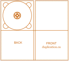
Second Draft of Back Cover for Digi Pack

For this cover I have cut down the sides of the picture in order to make it more of a reasonable and suitable size for a digi pack. I have also contrasted the back of the cover to the same of the front which is a contrast of 40% in order for them to match. I have also changed the text style and colour in order for the audience to make it easier to read. We may decide to use this for the inside cover instead.
Monday, 23 January 2012
Back Cover First Draft

This is the first draft of the back cover to our digi-pac. I need to add more visual effects and also the different contrasts we can incorporate. I will also need to add certain additions and packs to the cover such as, "including a 4 minute video to the numbre 1 song in the dubstep genre 2011".
Images for Digi Pak


First Drafts for Front Cover of Digi Pak


Sunday, 22 January 2012
Digipak Research
Digipaks typically consist of a gatefold paperboard or card stock outer binding, with one or more plastic trays capable of holding a CD or DVD attached to the inside. IMPAC Group, Inc. originally owned the Digipak trademark. That company was acquired by MeadWestvaco in 2000 and folded into its AGI Media division. Following this acquisition, the Digipak name and designs were licensed to manufacturers around the world and MeadWestvaco sold AGI Media to Atlas Holdings in 2010.

In this digipak, it gives an urban/ hip-hop kind of vibe to it because of the kind of font that is used and the type of tribal patterns used aswell. Also, notice how one of the back covers (back cover I think) is the same as on the CD itself. The white mask can cause an effect of mystery and that possbily some of the songs that are in the album could contain some personal or dark lyrics that may be offensive or maybe a way to tell the public about his personal problems.


These are the outside and inside of the digipak belonging to the band called "Enter Shikari". Enter Shikari is a band that is from St.Albans in Hertfordshire and the play a genre of music that is a combination of techno, rap and rock music. The inside of the digipak is a very colourful, tranquel and vibrant image of two trees and a field whilst the sun is setting. This image can illustrate the title of the album which is called "A Flash Flood Of Colour", this can relate to the imagery and diversity of the inside album cover. The triangle that is seen on the inside cover is also found on over covers of the digipak however, the triangle changes colour which again can relate to the album name and the other changes in colour througout the album.
The outside of the digipak consists of what "Enter Shikari Are:" this includes what instruments they play and who plays them, so this gives info on the band itself. It also includes "Gang Vocals" who are other people/artists outside of Enter Shikari. Again the triangle appears but in a different colour (blue) as it could contrast with the purple background. This cover of the digipak also includes legal rights and copyright protection logos and also says the types of management which has participated in making this album.
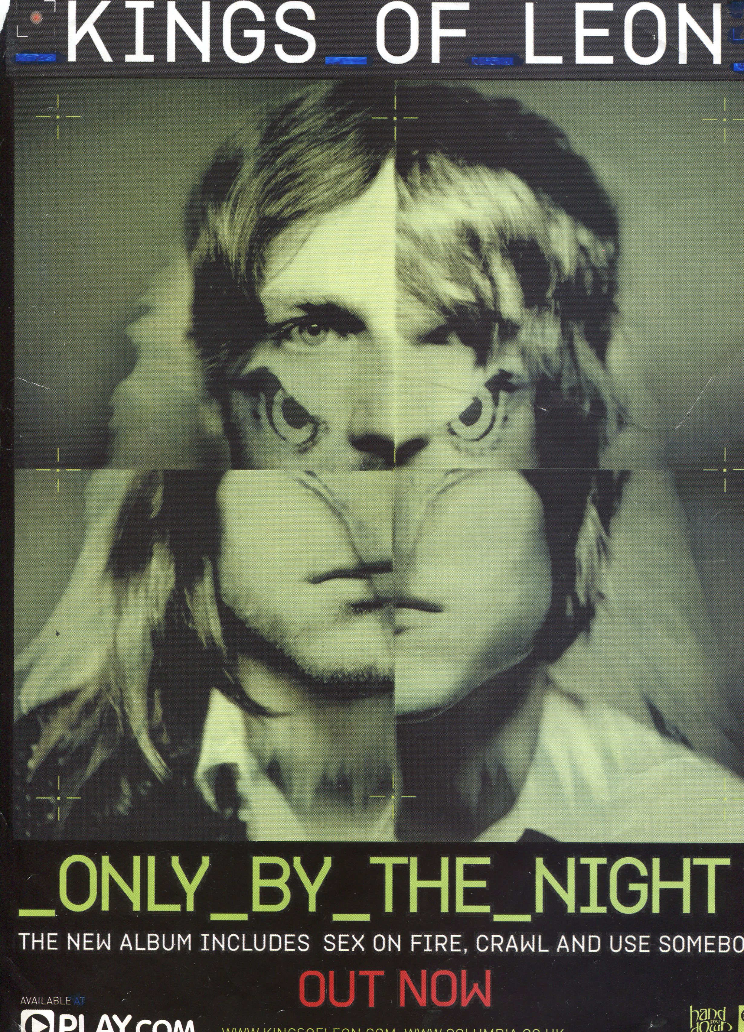
Album Adverts in Magazines:


Saturday, 21 January 2012
Parental Advisory

Due to the evolution of the music industry and music culture, more artists are encorporating swear words and explicts into their songs. This ofcourse some audience members may find offensive and therefore this logo pre-warns the audience but particulary the parents that this album/single contains some strong and offensive language. However, the quesion arises of "What can the parents actually do once the child hears these explicts?" A parent would not be able to stop the child from hearing these words but the only thing that they can do is not buy the album, which ofcourse affects the artists and their record companies.
Friday, 20 January 2012
Idea for video
A scene from the movie "Kidulthood" has given us inspiration and ideas on what we can incorporate into our video and also ideas and shots on how we can really show the emotion of the character. From the beginning of the clip to 1:26 is the time period of which depicts the effects and ideas from and how can can manipulate them into our own ideas. However, at the time of 8:46 the theme of the first time period as mentioned before carries on and this again can be shown in our video or there is the possibility that it could be left on a cliff hanger. However the video we put up for this clip has now been removed off YouTube and therefore we are unable to show it.
Another idea and shot that we are trying to incorporate into our music video, which are the shots of London City. It should include famous sites such as the London Eye and also St.Pauls Cathedral. This can be shown in various shots in the song "Keep It On a Low" by Dot Rotten who is a UK grime artist. We think that the shots of the London skyline and famous sites that it has such as the London Eye and Big Ben.
Another idea and shot that we are trying to incorporate into our music video, which are the shots of London City. It should include famous sites such as the London Eye and also St.Pauls Cathedral. This can be shown in various shots in the song "Keep It On a Low" by Dot Rotten who is a UK grime artist. We think that the shots of the London skyline and famous sites that it has such as the London Eye and Big Ben.
Thursday, 19 January 2012
Risk Assesment
HAZARD | A Severity | B Likelihood | Risk rating | |
1 | Tripping in Street | 2 | 8 | 16 |
2 | Road Danger | 7 | 6 | 42 |
3 | Train Danger | 6 | 5 | 30 |
4 | Attracting unwanted attention | 7 | 6 | 42 |
5 | Medical Issues | 5 | 2 | 10 |
6 | Problems at location | 4 | 2 | 8 |
7 | Terrorist Issues | 10 | 1 | 10 |
HAZARD | CONTROL MEASURE PRECAUTIONS |
1. | Wear appropriate footwear, be aware of surroundings |
2. | Be aware of cars on the road |
3. | Check trains are running and stand clear of the tracks |
4. | Don’t flash hardware and try to stay away from dangerous areas |
5. | Neither of us have health issues however if either of us are ill we will take medication |
6. | Check no protests are on before going to the location |
7. | Keep an eye out for suspicious people and stay clear of them |
Shooting Schedule
Shot no. | Date/Time | Location | Cast | Crew | Costume/Props | Equipment |
1 | 4/2/2012 Start filming at 4:00 pm – 4:20 pm | London - The Embankment | Ashley Rex | Will Trotter Louis Watkins Ashley Rex | Barbour Jacket Jeans Hoodie NY Flat Cap | Camera Tripod Light Light Filter |
2 | 4/2/2012 The first shot should take a few mins. 4:50 pm – 5:20 pm | London - The Embankment | Ashley Rex | Will Trotter Louis Watkins Ashley Rex | Barbour Jacket Jeans Hoodie NY Flat Cap | Camera Tripod Light Light Filter |
3 | 4/2/2012 5:20 pm – 5:45 | London - The Embankment | Ashley Rex | Will Trotter Louis Watkins Ashley Rex | Barbour Jacket Jeans Hoodie NY Flat Cap | Camera Tripod Light Light Filter |
4 | 4/2/2012 5:45 pm – 6:15 pm | London - The Embankment | Ashley Rex | Will Trotter Louis Watkins Ashley Rex | Barbour Jacket Jeans Hoodie NY Flat Cap | Camera Tripod Light Light Filter |
Subscribe to:
Posts (Atom)